Imagino
Customer Experience Platform
Imagino had a recognised logo, but their visual identity needed a refresh. We evolved their brand while preserving its core logo and colors, expanding the design language to create a more dynamic and versatile look. The result? A revitalized brand that feels fresh, modern, and ready for the future.
- Brand Development
- Website
Logo
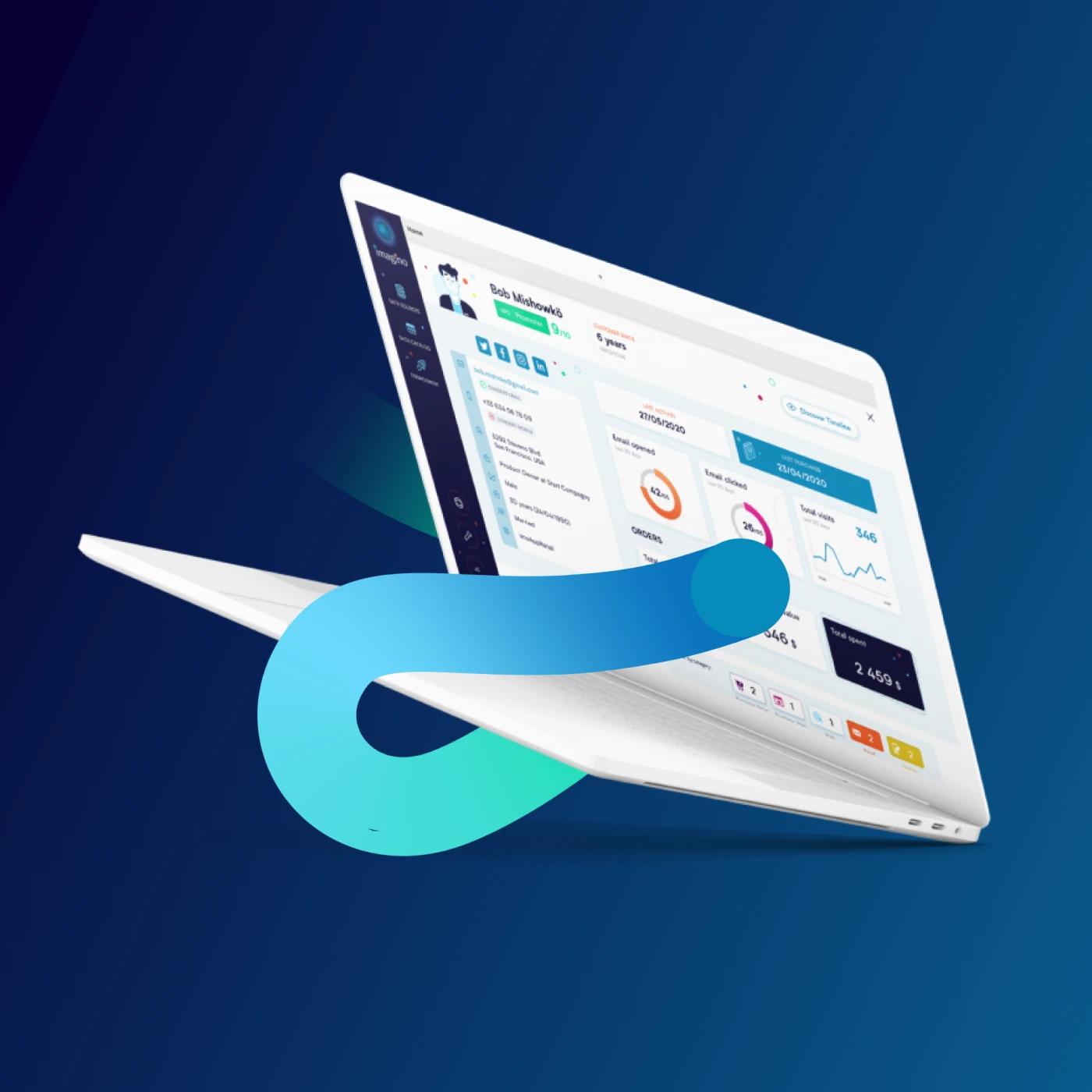
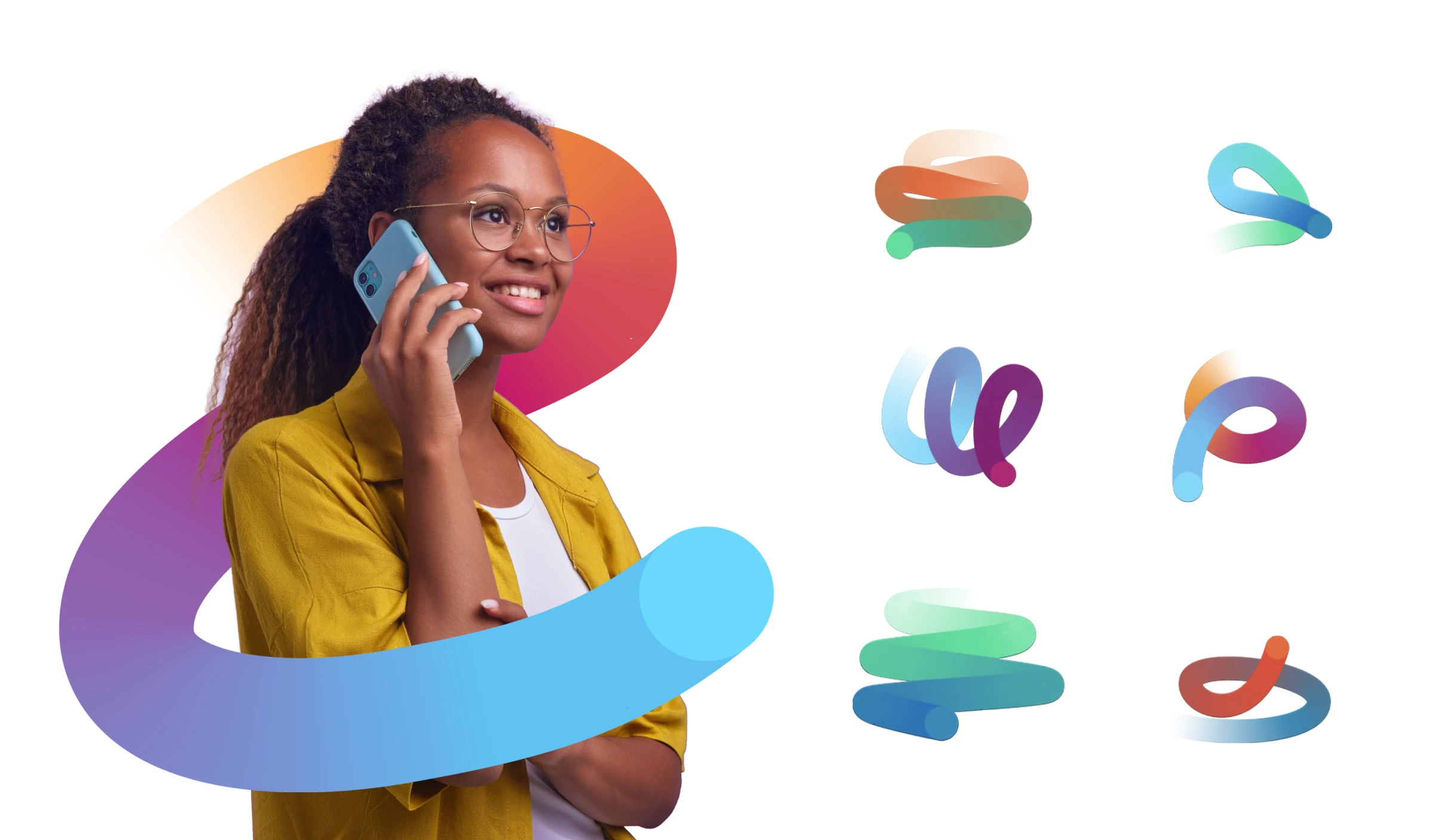
We wanted to retain the circles from the logo but give them greater depth, connecting them more closely to the brand's messaging. By introducing dynamic swirls and a more diverse colour palette, we added energy and vibrancy, reflecting the lively, client-focused platforms they offer. What started as a simple, often-used shape was transformed into a richer suite of versatile design elements, enabling the brand to tell its story in a colorful, yet approachable way.

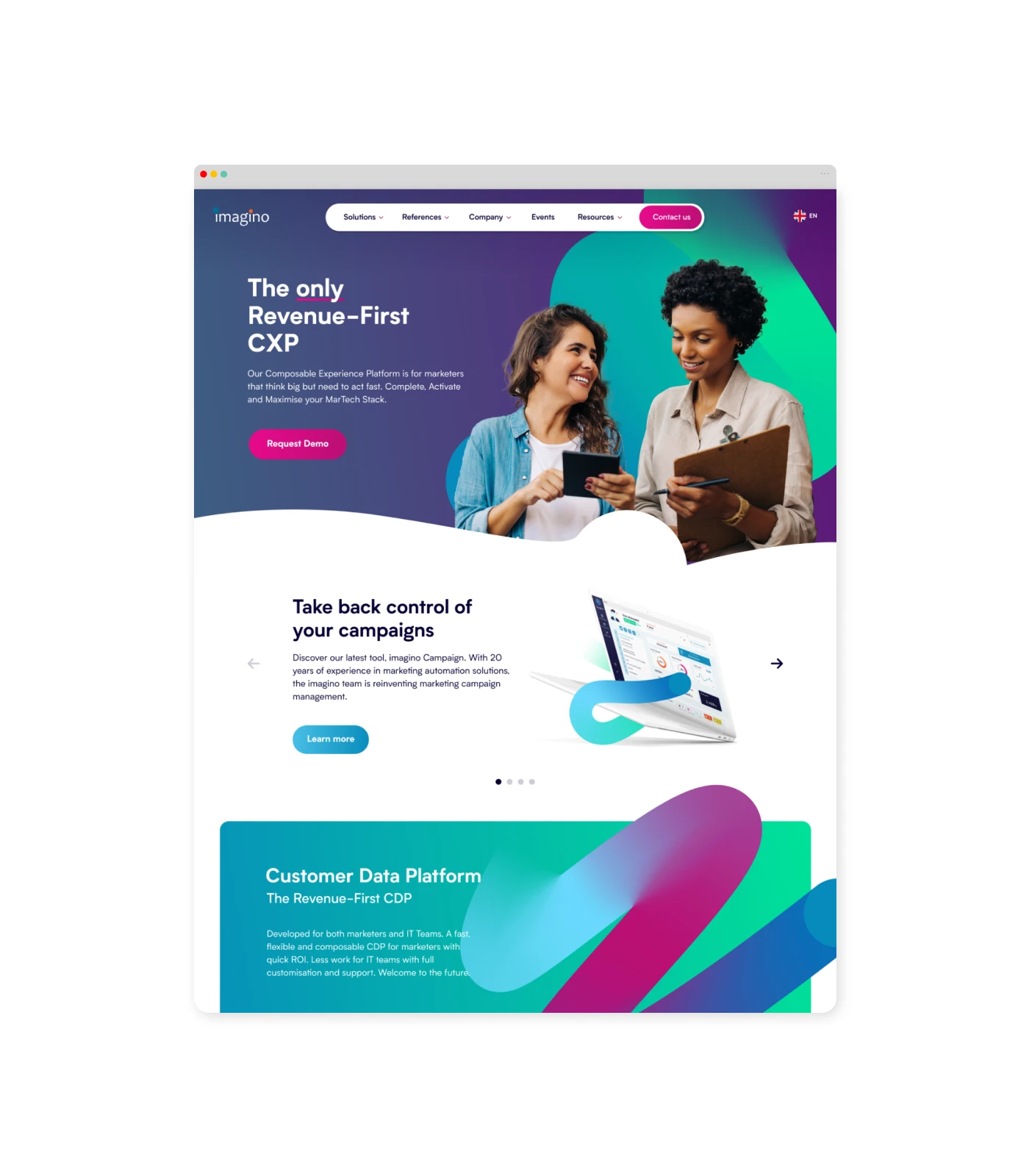
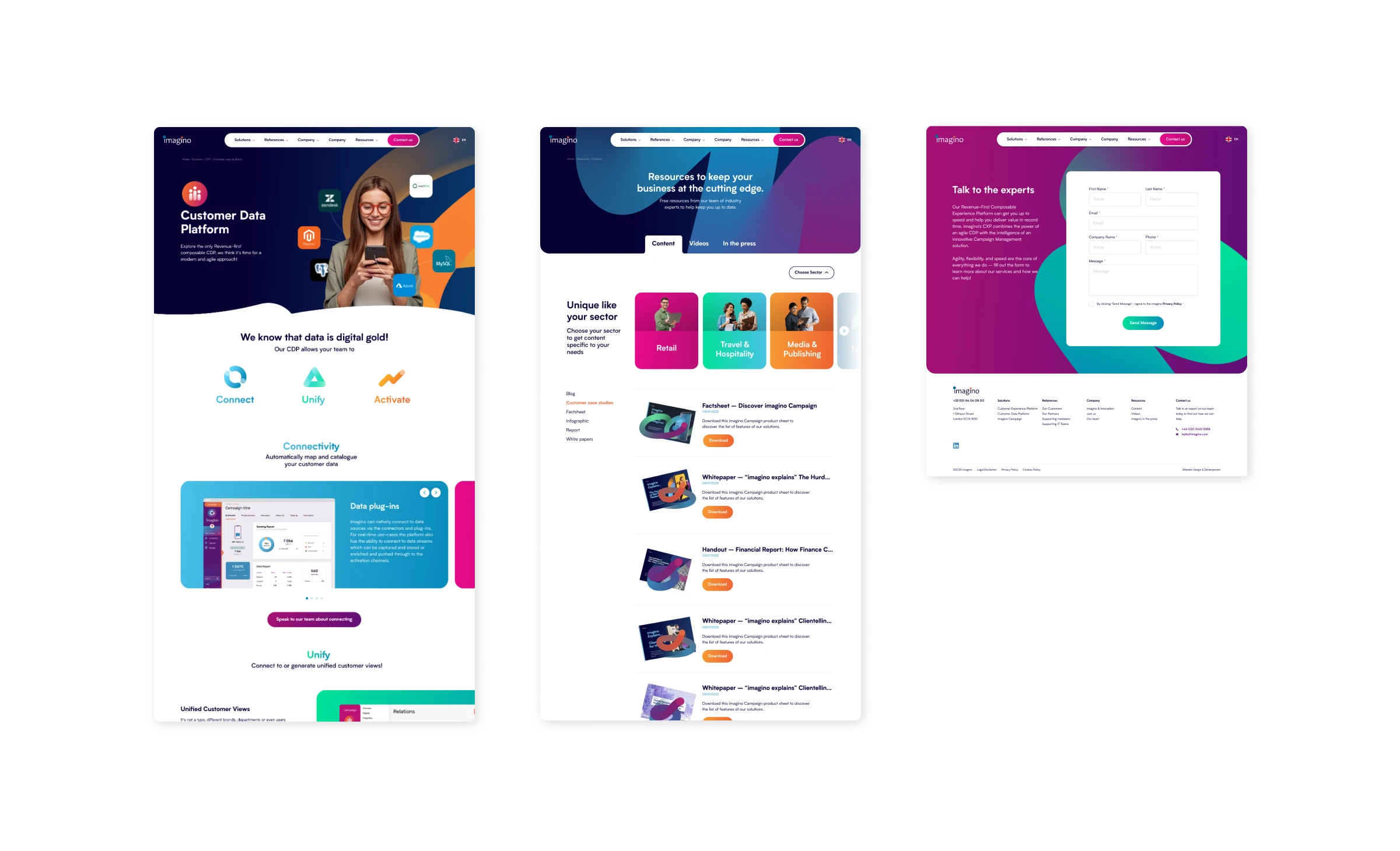
Website
Launched in 2025, the website features a simple yet bold design that lets users easily discover key benefits. It includes a custom-trained AI to answer questions, powered by a rich database of marketing materials. Flexible blocks allow for quick updates and customizable pages, ensuring a dynamic and engaging user experience aligned with the brand's vision.
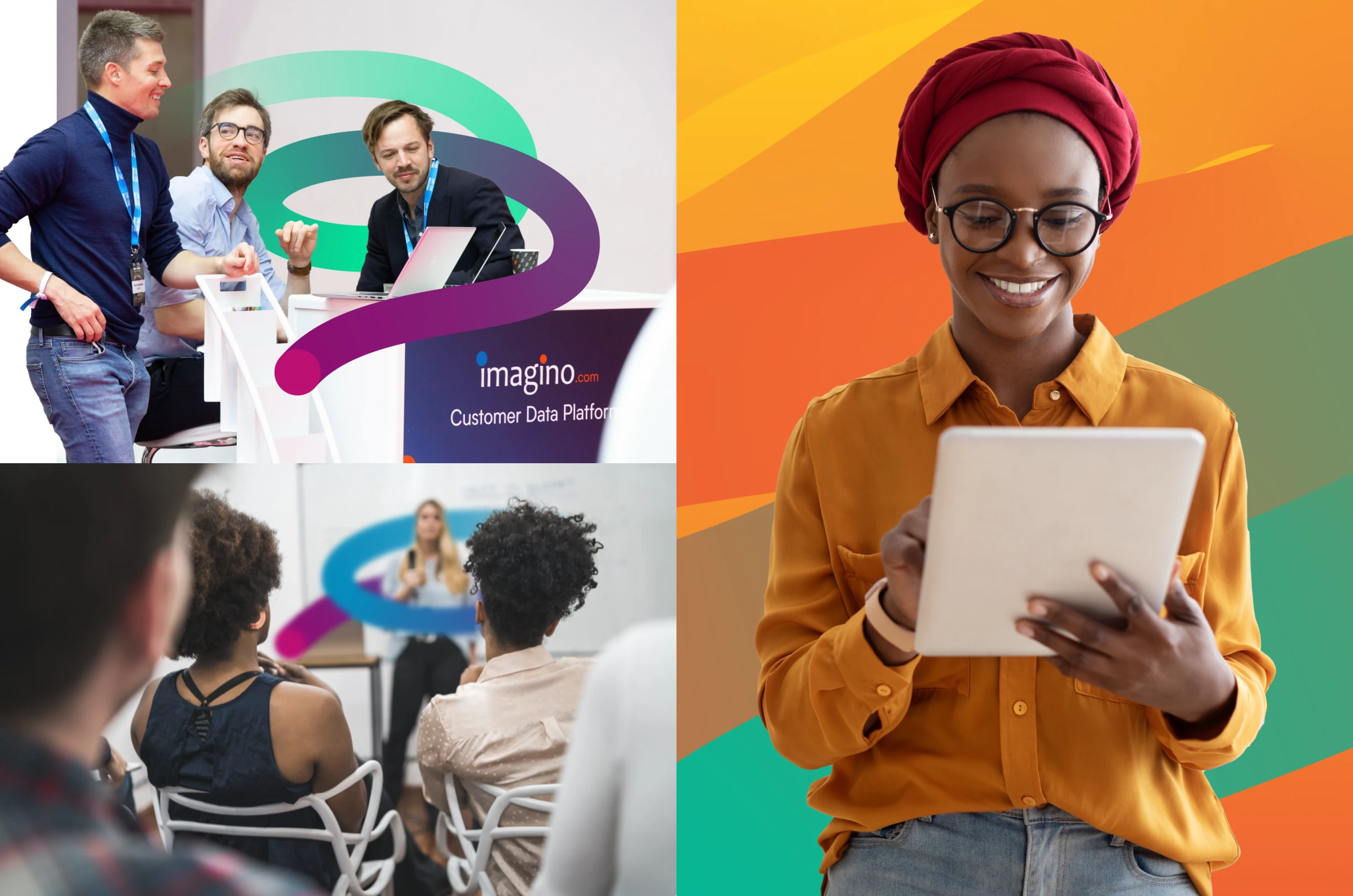
Graphics
The brand language was then extended into a comprehensive library of assets for the team to use, including icons, presentation templates, backgrounds, and imagery with interchangeable elements. This ensures consistency across all materials while providing flexibility for the team to easily create content that aligns with the brand’s visual identity.