The Agency Logo
Logo design
28th August 2015
We have created the new branding and website for The Agency. The company represents a spectrum of writers and directors working across film, television and theatre, from those at the peak of their careers to others who are just setting out. The logo development started with the question ‘How far do we take the new logo’ – just a slight update of the original logo, or a larger leap to change things completely? After developing various options, The Agency decided it was time for a bigger change and went for their more radical approach.
The logo needed to be bold and they wanted to keep part of their green colour scheme. We slightly altered the colour to make it less intense and to add a little more sophistication. The same is true of the typography which needed to have strength and reliability, but appear open and inviting. The logo has been spread across all stationery, the website and window vinyl.
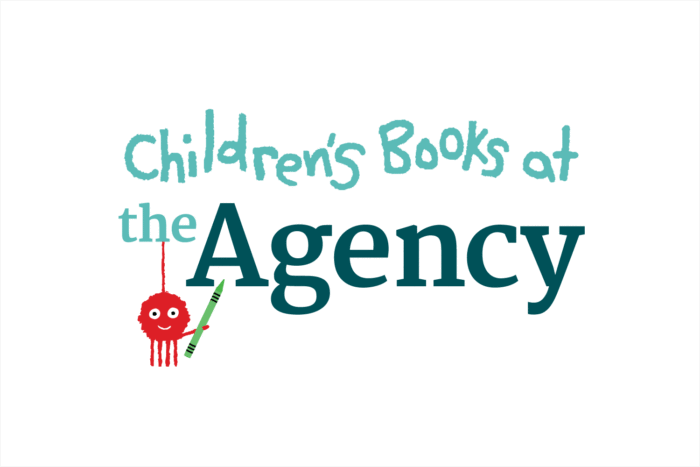
The logo had to work across all sectors and sit alongside the existing Children’s Books department of the company, which needed a slightly less businesslike feel. The original children’s text and character was created by one of the company’s illustrator clients, Simon Rickerty.
